The Impact of Color on Adolescents in Health and Healing Environments
Color plays a powerful role in how people experience a space. From influencing mood and energy levels to supporting emotional stability and reducing stress, thoughtful color selection can be used to empower otherwise similar spaces to each serve a vastly different purpose.
In rehabilitative environments, where safety, comfort, and emotional regulation are all deeply interconnected, color should be viewed as a therapeutic tool. The considerate use of color can significantly impact behavior and well-being by helping moderate emotional sensitivity, overstimulation, and environmental perception. This is especially important among children and teens, as they are more heavily influenced by the world around them.
How Color Influences Mood, Emotion, and Behavior
The human brain responds to color both psychologically and physiologically. Different colors can affect stress levels, trigger emotional associations, and even influence how energized or relaxed a person feels within a space.
From a psychological standpoint, different colors offer unique positive effects:
- Red: Energy and excitement
- Orange: Optimism and confidence
- Yellow: Joy and curiosity
- Green: Health and safety
- Blue: Trust and security
- Purple: Fantasy and imagination
It is important to note that color affects children and adults in different ways. Children’s nervous systems are still developing, while adults have a more refined visual cortex.
Children form strong emotional links to color at an early age, instinctively associating bright colors with happiness and dark colors with sadness or fear. For adults, color responses can vary from person to person based on culture, age, and personal experience.
The Effects of Bright Colors on Adolescents
Bright, saturated colors are often correlated with energy, creativity, optimism, and playfulness. Facilities can insert bright colors into adolescent environments to help make the space feel more welcoming and less institutional.
The use of colors like vibrant blues, greens, oranges, and yellows may help:
- Promote social interaction
- Encourage engagement and activity
- Boost positivity and optimism
- Establish visual interest and identity within a space
However, designers need to be aware that overly intense or excessive use of bright colors can also become overstimulating. Adolescents experiencing anxiety, trauma, or emotional dysregulation are particularly vulnerable.
For some individuals, highly saturated environments may contribute to:
- Heightened emotional responses
- Restlessness or increased agitation
- Difficulty focusing
- Sensory overload
Balance is key. Bright colors are often most effective when used intentionally as accents, wayfinding tools, or focal points paired with softer, grounding tones.
The Psychological Effects of Darker Colors
When used thoughtfully, darker hues can create spaces that feel safe, secure, and sophisticated. Deep blues, muted greens, and warm earth tones can help establish a sense of calm and stability within behavioral healthcare environments.
For adolescents especially, darker colors may:
- Support relaxation and decompression
- Establish feelings of safety and security
- Decrease visual overstimulation
- Provide a more mature, sophisticated feel
Much like the excessive use of bright colors, spaces that rely too heavily on dark colors can also produce adverse effects. The immoderate use of dark colors, without contrast or natural light, can feel isolating, heavy, or emotionally suppressive.
Creating Therapeutic Environments Through Color
The most effective healthcare spaces rarely rely on one color family alone. Instead, successful designers will often layer lighter neutrals and calming tones with strategic pops of color to create emotional balance throughout a space. Color selection is used intentionally to support the function and emotional goals of each environment.
For example:
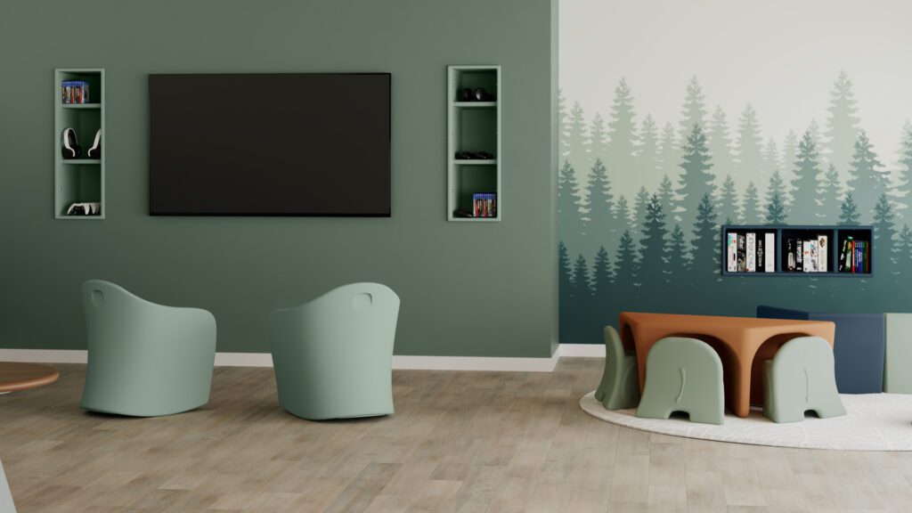
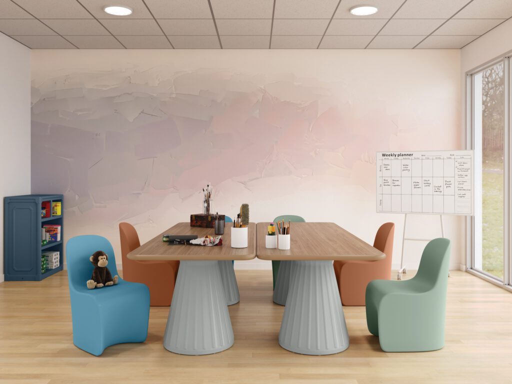
- Calming Spaces
- Soft blues, gentle greens, and warm neutrals are commonly found in patient rooms, quiet areas, and de-escalation spaces to promote relaxation and reduce stress.
- Social and Activity Areas
- Brighter accent colors encourage engagement, movement, and social interaction in lounges, group therapy rooms, dining spaces, and recreational areas.
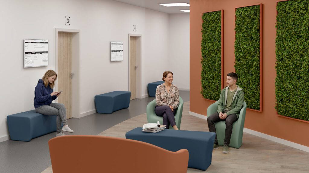
- Transitional Spaces
- Hallways and shared spaces benefit from balanced palettes that provide visual interest without becoming overstimulating.
- Trauma-Informed Design
- Warm, residential-inspired palettes help spaces feel less clinical and more human-centered, supporting emotional comfort and dignity.
Designing for Emotional Well-Being
There is no single “correct” color palette for adolescents in health and healing environments. The most successful spaces carefully consider the purpose of the environment, the unique needs of the patient population, potential sensory impacts, and the overall emotional experience the space is intended to establish.
When applied with purpose, color can be one of the most impactful tools for supporting healing, comfort, dignity, and human connection.
Learn More
Interested in expanding the color palette in your behavioral healthcare facility? Contact a Norix Rep to discuss the specifications for your next project: https://norix.com/contact-us/