The Role of Color in Healing Environments
Today’s leading healthcare architects and design professionals are incorporating principles of “evidence-based design” to create environments that can deliver state-of-the-art medicine and technology while meeting the physical and emotional needs of patients, family, and staff.
Numerous studies cited in a report by healthcare interior designer Tara Hill of Little Fish Think Tank in Atlanta, Georgia, and sponsored by DuPont, have shown that the architecture and design of healthcare buildings influence the speed of patient recovery, length of hospital stays, frequency of medical errors, and rate of staff turnover. Likewise, the role of color plays a major part in the feel of an environment.
Known factors in a “total healing environment” include having access to nature, incorporating positive distractions, imparting a sense of control, and providing social support spaces.
With a focus on visual elements as a primary source of impact, interiors that are stimulating—spaces that are not overly neutral, have interesting use of color, and introduce positive distractions that focus on nature and color – can be just as or more important than patient control or social support areas.
Conversely, stark interiors that lack references to natural elements, color, personality, or visual stimuli can raise a patient’s anxiety and cause ill effects. As a result, color is being used more purposefully to complement other design materials and textures that evoke nature. Evidence-based design suggests that it is better to err on the side of color, than the lack of it.
While science may not yet explain the extent to which specific colors impact individuals, or how specific colors may be implemented to achieve universal results, many psychiatrists and psychologists studying the subject agree that color has the effect of directing an individual’s attention outward, providing a diversion that can relieve the stress of internal mental tensions.
Therefore, colors previously considered “too bright for health care settings,” such as vibrant golds, citrus greens, crimsons, and Caribbean blues, are now thought to be vital therapeutic tools that directly promote healing. “Color”, Tara Hill points out, “is a very cost effective design tool to dramatically improve the environment at nominal cost.”
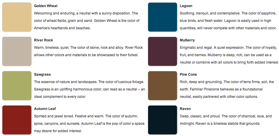
With the scientific research behind her, Hill has developed The Naturals Color Collection specifically for Norix intensive use furniture. Ideal for standard healthcare as well as behavioral healthcare facilities, the Naturals Collection celebrates eight distinct hues colors that reference organic materials including: Golden Wheat; River Rock; Sawgrass, Autumn Leaf; Lagoon; Mulberry; Pinecone; and Raven.

Ms. Hill has created a Whitepaper along with Norix on The Contributions of Color and planning for design in behavioral healthcare and correctional facilities. To read it, please CLICK HERE.
With the Naturals Collection facility designers can bring the familiar and calming tones of nature back into the built environment with the durability and safety features Norix furniture is known for. Visit the Norix website to view the extensive array of molded furniture pieces, wood and upholstery groups, as well as well as other seating options and surface treatments that are available in the Naturals Collection.